Painting with Primary Colors: Cyan, Magenta, and Yellow
You’ve been taught wrong about primary colors. They are not red, blue, and yellow but Cyan, Magenta, and Yellow. This great palette of colors allows you to create any hue you can imagine.
Of course, when working with these colors, you must add white to modify the color saturation as needed. I try to avoid using black pigment because it can make colors appear dull and sad.
Understanding Color Theory and Mixing
When I first began exploring the world of art, I had no idea how much power color theory held. It was about grabbing a brush and slapping whatever colors I liked onto the canvas. Let me tell you, I quickly learned that there’s so much more to it!
Color theory is like having a superpower. It’s the art of understanding how colors interact and play off each other. Picture this: a color wheel filled with primary, secondary, and tertiary colors, all ready to come alive on your canvas. Trust me, once you grasp the magic of the color wheel, your artwork will never be the same.
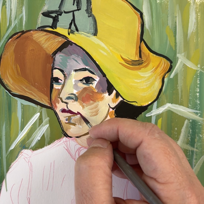
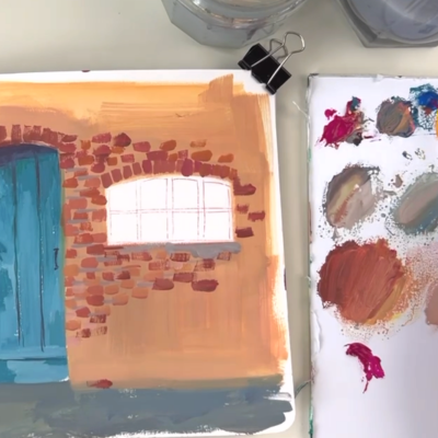
To illustrate the possibilities of these primary colors, I will use an image as a reference for today’s painting. The image has a large variety of colors inside, which provides a wealth of potential for our palette. You can follow along with the copyright-free image I use in this video.
The Color Wheel: Your Guide to Color Harmonies
At the heart of color theory lies the color wheel, a circular representation of colors. The color wheel consists of primary, secondary, and tertiary colors.
Primary colors, such as magenta, blue, and yellow, cannot be created by mixing other colors. Secondary colors, like purple, green, and orange, are created by mixing two primary colors. Tertiary colors are produced by mixing a primary color with its adjacent secondary color.
Color harmonies, also known as color schemes, are combinations of colors that create a pleasing visual effect. Some typical color harmonies include complementary, analogous, and triadic. Complementary colors sit opposite each other on the color wheel, while analogous colors are next to each other. Triadic colors form an equilateral triangle on the color wheel.

Temperature, Value, and Saturation: Adding Depth to Your Artwork
In addition to color harmonies, understanding temperature, value, and saturation is essential in creating depth and visual interest in your artwork.
Temperature refers to the perceived warmth or coolness of a color. Warm colors, such as reds and yellows, evoke feelings of energy and intensity. Cool colors, like blues and greens, create a sense of calmness and tranquility. By playing with temperature, you can evoke different emotions in your artwork.
Value refers to the lightness or darkness of a color. A range of values adds depth and dimension to your artwork. Experimenting with light and shadow using different values can create a sense of volume and form.
Color Saturation
Saturation refers to the intensity or purity of a color. Highly saturated colors are vivid and bold, while desaturated colors are more subdued and muted. Balancing saturation levels can create a sense of harmony and focal points in your artwork.
Most beginners are mixing colors that could be more realistic, that are either too saturated or too dull. It’s important to know the color theory to master the saturation of hues.
If you want to desaturate a color, like the brick color, mix magenta and yellow as an orange basis, then add a bit of cyan to desaturate it, as it’s the complementary color. You will have a bright brick color that you can tweak with more white, yellow, or magenta to get different brick colors.
You can also desaturate a color by adding grey inside, but you’ll lose the color’s intensity and get a dull hue.
Painting with Primaries
In the video, I use three primaries: Tyrian Rose or Magenta, primary blue, and primary yellow, along with white, for mixing. I suggest starting by mixing the darkest color because it is the most challenging to mix without black. As stated earlier, I avoid using black pigment to keep colors vibrant and lively.
Wait, I have some recommendations handpicked for you!!!
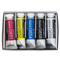
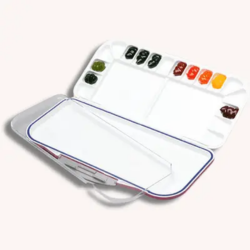
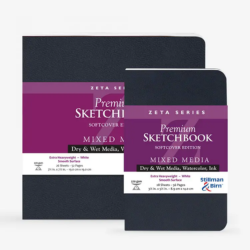
Here are my favorite supplies for gouache painting; you can check them out and buy them from @mazon, and I’ll get a tiny commission at no extra cost for you.
Conclusion
Knowing how to mix colors is crucial in painting as it allows you to create any hue you want. To learn more about the theory of color, I have a comprehensive class in which I discuss warm and cool colors, saturation, value, and how to weaken or brighten a color to get the exact hue you want.