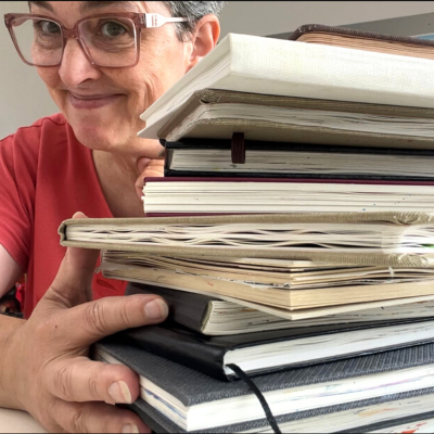
Good reference photos for portraits
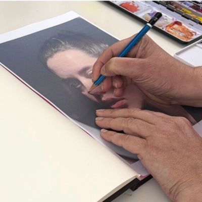
Good reference photos for portraits are crucial when it comes to painting. I’m painting a lot of portraits and use photos as references or inspiration. You need to have a good reference photo to work from, let’s see what it is.
Disclaimer: I assume that you can’t afford to have a living model just for you and that you’re working from reference photos. This is my point of view, I give you some general rules, and as always, artists can break rules!
You can either read the article or watch the video ‘What is a good reference photo for painting portraits’ below.
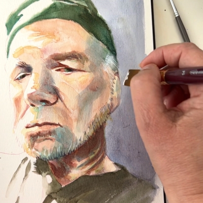
Good lighting
I place it first, as it’s the most important to me. Let’s see some examples. The face need to be properly lit, with enough light to see the features. Direct or harsh light should be avoided, as it will flatten every plane of the face.
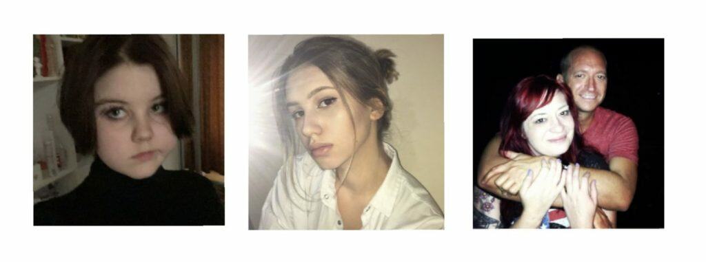

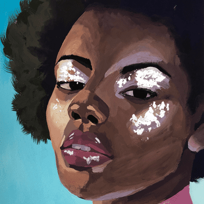
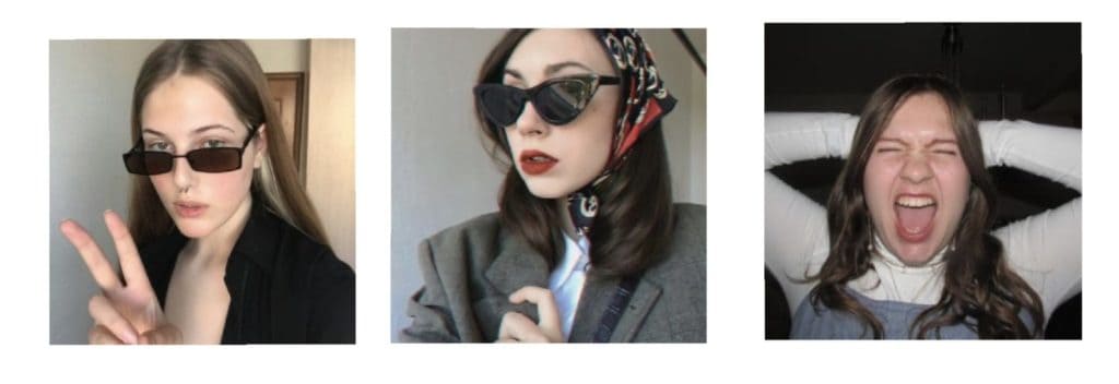
Good contrast in photos
A good way to see the contrast of an image is to place it in black and white. A well balanced image will have a large range of greys, and it will still be easy to read.
Here the difference between light and dark is extreme, and this is high contrast. I prefer to avoid this type of photo because it will be challenging to handle when painting.
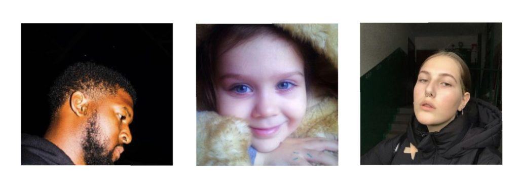
On the other hand, you can have photos where the values are pretty similar, and it will be challenging to give volume to the face. In the left image, the face looks like one single color. This can be perfect for an illustration style, but I’m more into semi-realism, and I need more information.
I would call those well lit, with good contrast, and a good range of values. A lot of information, and nice colors. I would pick them!
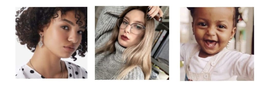
Items and surroundings
Depending on my purpose, I may want to avoid some tricky items in a photo: teeth, glasses, and hands. If you’re a beginner, adding these extra elements may give you a hard time.
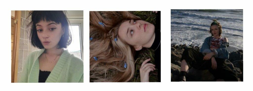
Feelings in reference photos
This is very personal, but I like to feel something when I look at a photo. Is the person expressing something? Do you see the face correctly? The eyes? Smile?
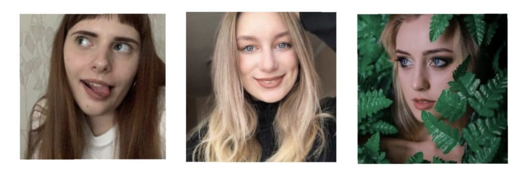
The left one is funny but lacks contrast. I could edit it, but that’s another story for another post!
The middle one is well balanced with values, the smile is appealing, there are not too many teeth, and she makes me feel good. That would be a good pick!
The right one needs a bit more lighting. I like the leaves around the face and the distant look.
Where to find copyright-free images for your art?
Now that you know a good reference photo for painting portraits, it’s time to find them! Watch this video to get my top 5 websites for copyright-free images
How to tweak a reference photo
I’ve found a photo I want to use, but it’s not quite what I want. What do I do? How can I save it from being just a so-so photo? And if it’s a bad photo, how can I salvage it? There are some simple solutions to this!
I hope this article about reference photos for portraits is helpful to your art!I love hearing from you, so please leave a comment below if you have any questions or ideas!