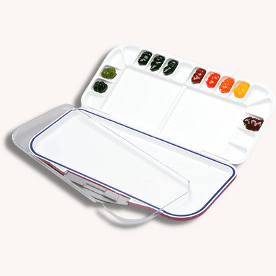
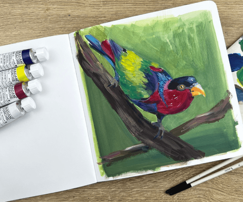
Gouache colors essentials
A well-rounded collection of Gouache tubes is essential for any artist to fully explore this medium’s possibilities and versatility. Gouache is a type of watercolor paint that is thicker and more opaque than traditional watercolor, making it ideal for many painting styles and techniques. How many colors should you get for gouache paint?
Table of Contents
- Primary Colors
- Warm and cool versions of primary colors
- Earth Tones
- Whites
- Extra colors
- Why not use black
- Conclusion
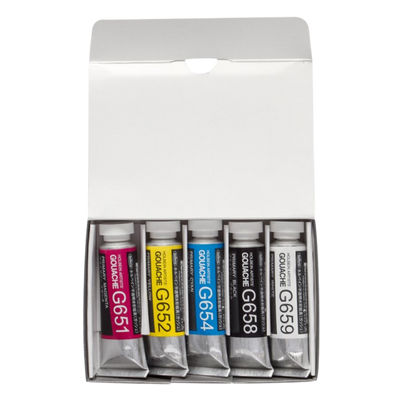
Primary Colors
The primary colors in gouache painting are pink, yellow, and blue. These colors are primary because they cannot be created by mixing other colors, and they are the foundation for all other colors and are essential for any artist to have in their collection. You can mix pretty much anything with primary colors plus white.
Pink, yellow, and blue are also known as “subtractive primary colors” because they will create a neutral gray or black when mixed in equal amounts. Primary painting colors differ from “additive primary colors” (red, blue, green) used in electronic displays and lights.
Pink is often associated with love and tenderness. It is an excellent color for creating a sense of warmth in your paintings and can be mixed with other colors to create a wide range of shades and tones.
Yellow is a bright, cheerful color often associated with happiness and energy, and it is a great color for creating highlights and adding a sense of light to your paintings. Mixed with other colors, yellow can create a range of warm tones and shades.
Blue is a cool color that is often associated with feelings of calm and serenity. It is an excellent color for creating a sense of depth and distance in your paintings and can create a range of cool tones and shades mixed with other colors.
Warm and cool versions of primary colors
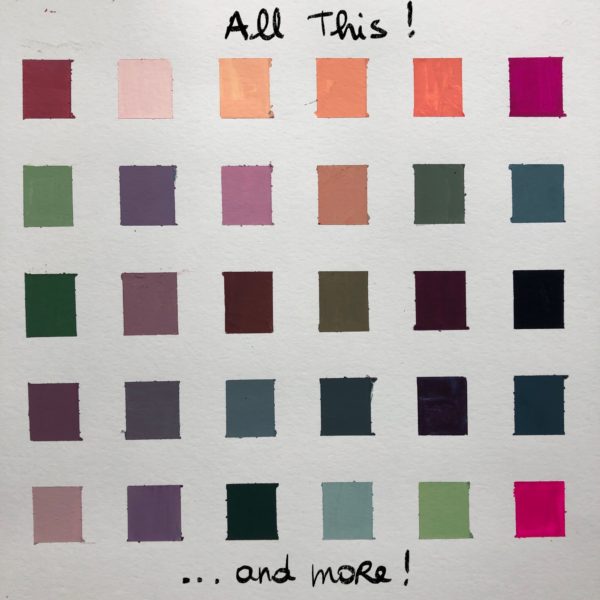
Having both warm and cool versions of the primary colors in your collection is important because it allows you to create a broader range of hues and shades in your paintings and to play with color temperatures.
Cool primary colors: Magenta, Cobalt blue, Lemon Yellow
Warm primary colors: Vermilion, Ultramarine blue, Warm Yellow
Both warm and cool versions of the primary colors allow you to mix and match to create an endless array of hues and shades. For example, you will mix various shades of green when combining a cool blue with a warm yellow. You can create a more dynamic and varied painting by combining warm and cool versions of the primary colors.
In addition, having both warm and cool versions of the primary colors allows you to create a sense of depth and movement in your paintings. Warm colors tend to appear closer to the viewer, while cool colors tend to appear farther away. By using both warm and cool versions of the primary colors, you can create a sense of depth and movement in your paintings.
Earth Tones
Earth tones are a range of natural and muted colors typically found in the natural world. They generally are made up of shades of brown, Ochre, and Sienna and are often used to create a sense of realism in landscapes and still lives. You can mix all those shades with the primary colors, but having them in tubes is more convenient.
Burnt umber or VanDyke brown is a versatile color that creates a wide range of shades, from light beige to dark chocolate. It is often used to create the base color for landscapes and the appearance of natural materials such as wood and soil.
Yellow Ochre is a warm, yellow-brown color often associated with the earth. It is a popular choice for creating natural materials such as soil and rocks and is also used to create the appearance of warm, sunny landscapes.
Burnt Sienna is a warm, reddish-brown color that is often used to create the appearance of natural materials such as wood and soil. It is also commonly used to make the appearance of warm, sunny landscapes and to develop a sense of depth and movement in paintings.
These earth tones help create a sense of realism in landscapes, still lives, and portraits. But they can also dull a color palette, so stay away from them if you’re looking for a fresh, vibrant color palette.
Whites
A good quality white Gouache tube in your collection is essential for any artist looking to create a wide range of tones and shades in their paintings. White gouache is a versatile color used in many different ways, from creating highlights and adding a sense of light to your paintings to creating a range of shades and tones when mixed with other colors. A high-quality white Gouache should be easy to mix and apply, with a smooth and consistent consistency that allows you to achieve the desired effects in your paintings.
You will find different names for white gouache, depending on the brands:
- Permanent white
- Zinc white
- Chinese white
- Titanium white
Using white for mixing colors
When mixing colors, I use Zinc or Chinese white. It’s less expensive and also less opaque. To find the opacity of a color, look at the square or circle symbol on the tube. Zinc and Chinese white are usually half-filled, meaning they are not entirely opaque. This is fine for mixing colors, as you’ll get less filler and more pigments.
Using white for highlights
When you want very opaque and intense white, look for Titanium or permanent white. Most of all, look for the opacity symbol. It should be filled. Use a clean brush and water to grab your white and add it to the end of your paintings as highlights.
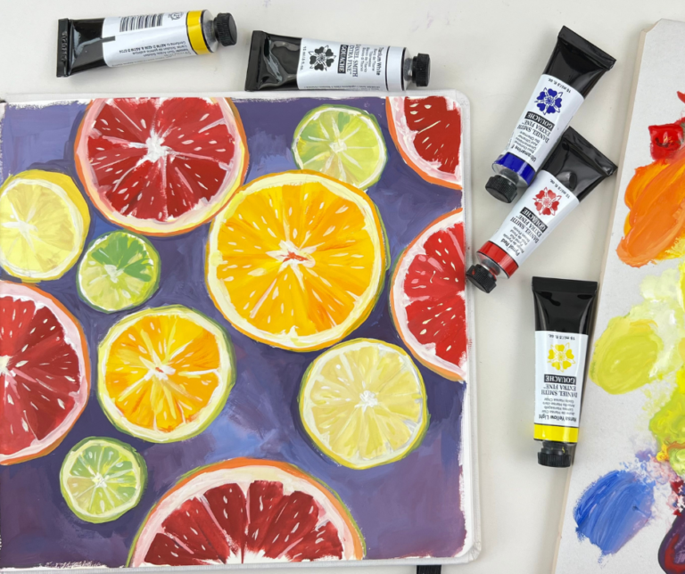
Extra colors
Neon colors are a great way to add interest and contrast to your paintings. They are bright and vibrant colors that create bold statements and eye-catching contrasts. When using neon colors, it’s essential to use them sparingly and in conjunction with other colors. You can use them as accent colors or create highlights in your painting.
My favorite one is Opera pink, a bright pink with a hint of purple. It’s the perfect color for adding interest to a portrait or creating contrast. Although the pigment is not lightfast, so I use it only in sketchbooks.
Neon or bright colors can be found in different brands, usually labeled neon or fluorescent colors. It’s important to note that these colors can be transparent or semi-transparent, so they work best when used over a darker background.
When using neon colors, it’s important to use a clean brush and clean water to grab your paint, and to use them sparingly, as they can easily overpower other colors in your painting.
Why not use black
Many artists find that black is not a necessary color, as it can be created by mixing the primary colors of pink, yellow, and blue. Using these colors, you can create a range of shades and tones, including neutral gray and warm or cool black.
Additionally, using black can create a sense of flatness and darkness in a painting. Instead of using black, artists can use a variety of dark shades and tones, such as dark blues, greens, and purples, to create depth and shadow in a painting. These colors can create more dynamic and varied artwork, rather than black, which can make the image look dull. If you don’t want to mix your dark shades, you can buy a tube of Payne’s grey, a dark grey with blue undertones.
Conclusion
In conclusion, using the right colors is essential for any artist to fully explore the possibilities of gouache and painting. From the crucial primary colors of pink, yellow, and blue to earth tones, white, and neon, having a well-rounded collection of Gouache tubes allows you to mix and match to create an endless array of hues and shades and achieve a wide range of effects in your paintings.
By following these tips and recommendations, you’ll be able to fully explore the possibilities of Gouache painting and take your artwork to the next level by mixing your colors.