Color Theory Applied to Dune 2
In the visually stunning sequel to Denis Villeneuve’s adaptation of Frank Herbert’s Dune, color theory transcends mere aesthetic appeal, becoming a storyteller in its own right. Let’s see how color theory applies to Dune 2.
Dune 2 not only expands the narrative of the Atreides family’s struggle for control over the desert planet of Arrakis but also delves deeper into the emotional and political complexities of its vast universe through a meticulously chosen color palette.
Let’s journey through the sandy dunes and beyond, exploring how color in Dune 2 serves as a lens to view the film’s mood, emotion, and character dynamics.
The Hues of Arrakis: Golds, Browns, and Oranges
The desert planet of Arrakis is home to the most coveted substance in the universe, the spice Melange, which is central to the Dune saga. Villeneuve and his team masterfully use a palette of golds, browns, and oranges to depict the harsh, unyielding terrain of the desert.
These colors don’t just serve the purpose of setting the scene; they evoke a sense of vastness and desolation, mirroring the protagonists’ internal struggle as they navigate the political and environmental challenges of Arrakis.
The use of warm colors also highlights the importance of spice, with its glowing orange hue symbolizing its value and peril.
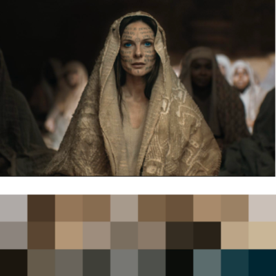
Even if the orange is glowing, all colors are desaturated, staying in a low-key range. I’ve extracted the color palette from some movie stills. You can see how the colors are close to each other in an analogous palette.

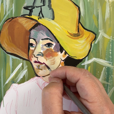
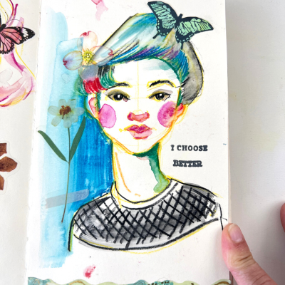
The Fremen: Cerulean Hues and the Eyes of Ibad
A distinguishing feature of the Fremen, the native inhabitants of Arrakis, is their deep cerulean blue eyes, a physical adaptation to spice consumption.
This stark, vibrant blue stands out against the desert backdrop, immediately drawing the viewer’s attention and signifying the Fremen’s unique bond with their planet. Because blue is (kind of) complementary to oranges, it stands out against the warm colors.
I tried to convey this in my Lady Jessica Portrait with gouache.
Of course, I had to adapt to the gouache medium, as I’m not a film director with cameras and lights. I had a hard time keeping all the colors desaturated while conveying Lady Jessica’s fierce look. You can watch the video where I paint this portrait.
The Imperial Forces: Imposing Reds and Blacks
The arrival of the imperial forces brings a starkly different color palette, dominated by reds and blacks. This color combination is a reminder of the early 30s with the nazi domination.
These colors are often associated with power, danger, and aggression, aptly reflecting the imperial ambition and their threat to Arrakis and its people.
The Sardaukar, the fearsome imperial soldiers, are often enveloped in shadows or seen against a backdrop of fiery explosions, enhancing their menacing presence.
Emotional and Political Undercurrents: Color as Subtext
Beyond setting the mood and defining character, color in Dune 2 also subtly communicates its characters’ shifting allegiances and internal conflicts.
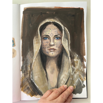
For instance, Lady Jessica’s wardrobe evolves throughout the film, reflecting her changing roles—from a royal court member to a mother and protector in exile.
The gradual darkening of her attire mirrors her internal journey and growing resolve to navigate the treacherous political landscape of Arrakis.
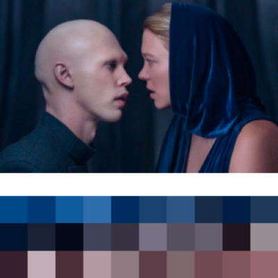
Here, we have a cool palette, still desaturated, with complementary colors.
A Visual Feast: The Role of Lighting and Shadow
It’s not just the color itself but the interplay of light and shadow that adds depth to Villeneuve’s Arrakis. The shifting shadows of the colossal dunes create a dynamic, ever-changing landscape that feels almost alive, resonating with the tumultuous nature of the story.
This chiaroscuro effect beautifully complements the color palette, enhancing the emotional resonance of each scene and immersing the viewer deeper into the world of Dune.
Final Thoughts
In Dune 2, color serves as a visual and narrative device, enriching the story and deepening the viewer’s engagement with the film’s complex universe.
Denis Villeneuve’s masterful use of color theory elevates the cinematic experience, making each frame a meticulous painting that captures the essence of Frank Herbert’s iconic world.
As viewers and artists, we are reminded of the power of color to convey mood, emotion, and even philosophy. Whether you’re a cinephile, a color theory enthusiast, or a budding filmmaker, Dune 2 offers a captivating study of how color can tell a story as profound and layered as the narrative it accompanies.
The hues of Arrakis await—each color not just seen but felt, inviting us to explore the depths of Villeneuve’s vision and the timeless saga of Dune.
If you want to know more about color theory and how you can apply it to your art, I have a complete course about color mixing.