How to Make Gouache Colors Pop on Black Backgrounds
Painting with gouache on a black background can feel like a bold move, and for many artists, it starts as a frustrating one. You try your favorite colors, but they vanish into the paper. The paint streaks, the layers don’t hold, and everything looks flat. But when you understand how gouache behaves on dark surfaces, it becomes one of the most powerful ways to add depth and vibrancy to your work.
In this post, you’ll learn six essential tips to make your gouache paintings stand out on black backgrounds. Whether you’re using paper, gesso, or ink as your surface, these insights will help you build confident shapes, strong contrast, and colors that hold their own.
You can watch the video if you prefer
1. Choose Your Black Surface Wisely
When I say “painting on black,” I don’t necessarily mean using black paper. While black mixed-media paper is standard, it often looks dull. And if you try to take a photo of your painting on black paper, it will usually look greyish rather than black. Instead, I like to create my black surface using one of four options: acrylic paint, acrylic ink, Indian ink, or black gesso.
Each one behaves differently. Indian ink gives a rich black but has a slight shine I don’t love. Acrylic paint is smooth, but sometimes, it can be too slick, making it challenging to maneuver on an acrylic background with gouache paint. My go-to is black gesso. It’s matte, richly black, and has a slight tooth that holds gouache beautifully. When comparing black paper with Indian ink or gesso, you’ll immediately see a deeper, more dramatic black that sets the stage for vibrant painting.
Tip for applying black gesso:
Squeeze a blob of paint onto your paper, then pull the paint with a silicon wedge or a credit card. By doing so, you’ll get a flat surface without visible brushstrokes.
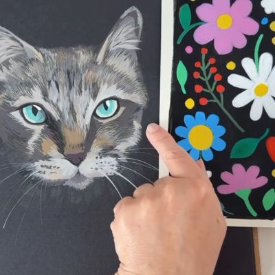
2. Start With Strong Shapes
Once you’ve prepared your black surface, your first layer should be about bold, confident color placement. It’s not the time for detail yet. Use a paint consistency that’s neither too thick nor too runny, and block in your shapes. You can read this article for more information about gouache consistency.
Think of this layer as a map. You want to reduce the black showing through and set the composition. Clean shapes with well-placed color masses will support all the details you add later. Don’t worry about brushstrokes at this stage—they’re part of the process.
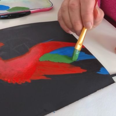
3. Understand Color Relativity on Black
One of the trickiest parts of painting on a dark surface is judging contrast. A color that looks light on white paper can appear much darker on black—and vice versa. To illustrate this, I often compare the same swatch on white and black: the effect is dramatic.
Tip for values on black:
When you’re painting your background, add black gesso to a scrap of paper to use for swatching your colors.
You need to adjust your values intentionally. Use the dark background as your deepest shadow, and scale the rest of your color values accordingly. For highlights, avoid pure white unless you want high contrast. Often, a warm grey or toned white is more effective and natural-looking.
One simple trick to check your values: squint. When you squint, you’ll get a clearer sense of how the values are working against the black background.
Do you want more gouache tips?
Fast, confidence-building shortcuts for colour mixing, brush control & consistent paint texture. Perfect if you’re still fighting “streaky” strokes or muddy mixes.

4. Know What Opacity Means
Opacity is everything when it comes to gouache on dark surfaces. Transparent or semi-transparent paint will disappear on black. You need to be able to identify which paints are opaque—and that starts with reading the labels on your tubes.
Artist-quality gouache often has a symbol to indicate opacity. A filled square means fully opaque; a half-filled one means semi-opaque; and an empty circle or square means transparent. For example, some lemon yellows are entirely transparent, while others are rich and opaque.
Always test your paint before committing. A quick swatch on your chosen black surface will save you time and frustration.
5. Master the Second Layer
Once your first layer is dry, it’s time for detail. However, this is where many artists encounter trouble: the second layer lifts the first, unintentionally blends, or appears chalky.
The solution? Creamy consistency and confidence. Your second layer should be thicker—think yogurt, not soup. Apply it with minimal strokes. If you scrub or overwork an area, you risk lifting the dry paint underneath. And if you’re layering a new color on top of another, this can create a muddy effect.
Let the paint dry completely between layers. This not only prevents lifting but allows your details to sit cleanly on top.

6. Save the Highlights for the End
The last step is often the most satisfying. Highlights should be crisp, intentional, and added only once everything else is in place. Whether it’s toned white or a bright yellow, these accents create sparkle and guide the eye.
Place them sparingly—on the beak of a bird, the edge of a leaf, or the tip of a brushstroke. A little goes a long way, especially against a black background. The contrast is powerful, and highlights are your final opportunity to define form and create focus.
Common Mistakes to Avoid
Mistake 1: Too Much Water on the Second Layer
This can cause streaks, lifting, and loss of opacity. The fix: use less water and more paint.
Mistake 2: Applying Highlights Too Soon
If the painting isn’t fully developed, highlights can look out of place or need redoing. Wait until everything else is in place—then apply them cleanly and confidently.
Final Thoughts: Make the Most of Black Backgrounds
Painting on a black background isn’t a challenge—it’s a creative advantage. Once you understand how to layer your gouache, adjust your values, and use opacity to your benefit, your colors won’t just survive the black background—they’ll stand out brilliantly.
If you’re ready to keep exploring, check out the full gouache playlist on my YouTube channel.